Data APIs and pandas operations
Several of the notebooks we’ve already explored loaded datasets into a python pandas dataframe for analysis. Local copies of some of these datasets had been previously saved to disk in a few cases we read in the data directly from an online sources via a data API. This section explains how that is done in a bit more depth. Some of the possible advantages of reading in the data this way is that it allows would-be users to modify and extend the analysis, perhaps focusing on different time-periods or adding in other variables of interest.
Easy to use python wrappers for data APIs have been written for the World Bank and several other online data providers (including FRED, Eurostat, and many many others). The pandas-datareader library allows access to several databases from the World Bank’s datasets and other sources.
If you haven’t already installed the pandas-datareader library you can do so directly from a jupyter notebook code cell:
!pip install pandas-datareader
Once the library is in installed we can load it as:
In [1]:
%matplotlib inline
import seaborn as sns
import warnings
import numpy as np
import statsmodels.formula.api as smf
import datetime as dt
In [2]:
from pandas_datareader import wb
Data on urban bias
Our earlier analysis of the Harris_Todaro migration model suggested that policies designed to favor certain sectors or labor groups
Let’s search for indicators (and their identification codes) relating to GDP per capita and urban population share. We could look these up in a book or from the website http://data.worldbank.org/ but we can also search for keywords directly.
First lets search for series having to do with gdp per capita
In [3]:
wb.search('gdp.*capita.*const')[['id','name']]
Out[3]:
| id | name | |
|---|---|---|
| 685 | 6.0.GDPpc_constant | GDP per capita, PPP (constant 2011 internation... |
| 7588 | NY.GDP.PCAP.KD | GDP per capita (constant 2010 US$) |
| 7590 | NY.GDP.PCAP.KN | GDP per capita (constant LCU) |
| 7592 | NY.GDP.PCAP.PP.KD | GDP per capita, PPP (constant 2011 internation... |
We will use NY.GDP.PCAP.KD for GDP per capita (constant 2010 US$).
You can also first browse and search for data series from the World Bank’s DataBank page at http://databank.worldbank.org/data/. Then find the ‘id’ for the series that you are interested in in the ‘metadata’ section from the webpage
Now let’s look for data on urban population share:
In [4]:
wb.search('Urban Population')[['id','name']].tail()
Out[4]:
| id | name | |
|---|---|---|
| 9999 | SP.URB.GROW | Urban population growth (annual %) |
| 10000 | SP.URB.TOTL | Urban population |
| 10001 | SP.URB.TOTL.FE.ZS | Urban population, female (% of total) |
| 10002 | SP.URB.TOTL.IN.ZS | Urban population (% of total) |
| 10003 | SP.URB.TOTL.MA.ZS | Urban population, male (% of total) |
Let’s use the ones we like but use a python dictionary to rename these to shorter variable names when we load the data into a python dataframe:
In [5]:
indicators = ['NY.GDP.PCAP.KD', 'SP.URB.TOTL.IN.ZS']
Since we are interested in exploring the extent of ‘urban bias’ in some countries, let’s load data from 1980 which was toward the end of the era of import-substituting industrialization when urban-biased policies were claimed to be most pronounced.
In [6]:
dat = wb.download(indicator=indicators, country = 'all', start=1980, end=1980)
In [7]:
dat.columns
Out[7]:
Index(['NY.GDP.PCAP.KD', 'SP.URB.TOTL.IN.ZS'], dtype='object')
Let’s rename the columns to something shorter and then plot and regress log gdp per capita against urban extent we get a pretty tight fit:
In [8]:
dat.columns = [['gdppc', 'urbpct']]
dat['lngpc']  = np.log(dat.gdppc)
In [9]:
g = sns.jointplot("lngpc", "urbpct", data=dat, kind="reg",
                  color ="b", size=7)
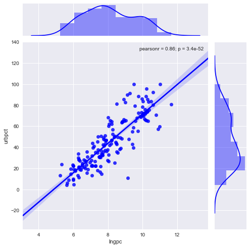
That is a pretty tight fit: urbanization rises with income per-capita, but there are several middle income country outliersthat have considerably higher urbanization than would be predicted. Let’s look at the regression line.
In [10]:
mod = smf.ols("urbpct ~ lngpc", dat).fit()
In [11]:
print(mod.summary())
                            OLS Regression Results
==============================================================================
Dep. Variable:                 urbpct   R-squared:                       0.744
Model:                            OLS   Adj. R-squared:                  0.743
Method:                 Least Squares   F-statistic:                     494.3
Date:                Wed, 03 May 2017   Prob (F-statistic):           3.43e-52
Time:                        15:26:52   Log-Likelihood:                -670.94
No. Observations:                 172   AIC:                             1346.
Df Residuals:                     170   BIC:                             1352.
Df Model:                           1
Covariance Type:            nonrobust
==============================================================================
                 coef    std err          t      P>|t|      [0.025      0.975]
------------------------------------------------------------------------------
Intercept    -68.0209      5.185    -13.120      0.000     -78.255     -57.787
lngpc         13.9583      0.628     22.233      0.000      12.719      15.198
==============================================================================
Omnibus:                        8.555   Durbin-Watson:                   2.204
Prob(Omnibus):                  0.014   Jarque-Bera (JB):               17.062
Skew:                          -0.027   Prob(JB):                     0.000197
Kurtosis:                       4.542   Cond. No.                         47.3
==============================================================================

Warnings:
[1] Standard Errors assume that the covariance matrix of the errors is correctly specified.
Now let’s just look at a list of countries sorted by the size of their residuals in this regression line. Countries with the largest residuals had urbanization in excess of what the model predicts from their 1980 level of income per capita.
Here is the sorted list of top 15 outliers.
In [12]:
mod.resid.sort_values(ascending=False).head(15)
Out[12]:
country               year
Singapore             1980    35.469714
Chile                 1980    30.563014
Malta                 1980    30.448467
Hong Kong SAR, China  1980    29.957702
Uruguay               1980    29.143223
Argentina             1980    25.369855
Cuba                  1980    24.148529
Belgium               1980    20.731859
Israel                1980    20.456625
Iraq                  1980    20.262678
Peru                  1980    17.810693
Myanmar               1980    17.719561
Bulgaria              1980    17.360914
Jordan                1980    15.706878
Colombia              1980    15.258744
dtype: float64
This is of course only suggestive but (leaving aside the island states like Singapore and Hong-Kong) the list is dominated by southern cone countries such as Chile, Argentina and Peru which in addition to having legacies of heavy political centralization also pursued ISI policies in the 60s and 70s that many would associate with urban biased policies.
Panel data
Very often we want data on several indicators and a whole group of countries over a number of years. we could also have used datetime format dates:
In [13]:
countries = ['CHL', 'USA', 'ARG']
start, end = dt.datetime(1950, 1, 1), dt.datetime(2016, 1, 1)
dat = wb.download(
    indicator=indicators,
    country = countries,
    start=start,
    end=end).dropna()
Lets use shorter column names
In [14]:
dat.columns
Out[14]:
Index(['NY.GDP.PCAP.KD', 'SP.URB.TOTL.IN.ZS'], dtype='object')
In [15]:
dat.columns = [['gdppc', 'urb']]
In [16]:
dat.head()
Out[16]:
| gdppc | urb | ||
|---|---|---|---|
| country | year | ||
| Argentina | 2015 | 10501.660269 | 91.751 |
| 2014 | 10334.780146 | 91.604 | |
| 2013 | 10711.229530 | 91.452 | |
| 2012 | 10558.265365 | 91.295 | |
| 2011 | 10780.342508 | 91.133 |
Notice this has a two-level multi-index. The outer level is named ‘country’ and the inner level is ‘year’
We can pull out group data for a single country like this using the
.xs or cross section method.
In [17]:
dat.xs('Chile',level='country').head(3)
Out[17]:
| gdppc | urb | |
|---|---|---|
| year | ||
| 2015 | 14660.505335 | 89.530 |
| 2014 | 14479.763258 | 89.356 |
| 2013 | 14364.140970 | 89.175 |
(Note we could have also used dat.loc['Chile'].head())
And we can pull a ‘year’ level cross section like this:
In [18]:
dat.xs('2007', level='year').head()
Out[18]:
| gdppc | urb | |
|---|---|---|
| country | ||
| Argentina | 9830.759871 | 90.445 |
| Chile | 12223.484611 | 87.926 |
| United States | 49979.533843 | 80.269 |
Note that what was returned was a dataframe with the data just for our selected country. We can in turn further specify what column(s) from this we want:
In [19]:
dat.loc['Chile']['gdppc'].head()
Out[19]:
year
2015    14660.505335
2014    14479.763258
2013    14364.140970
2012    13963.665402
2011    13385.131216
Name: gdppc, dtype: float64
Unstack data
The unstack method turns index values into column names while stack method converts column names to index values. Here we apply unstack.
In [20]:
datyr = dat.unstack(level='country')
datyr.head()
Out[20]:
| gdppc | urb | |||||
|---|---|---|---|---|---|---|
| country | Argentina | Chile | United States | Argentina | Chile | United States |
| year | ||||||
| 1960 | 5605.191722 | 3630.391789 | 17036.885170 | 73.611 | 67.836 | 69.996 |
| 1961 | 5815.233002 | 3692.112435 | 17142.193767 | 74.217 | 68.660 | 70.377 |
| 1962 | 5675.060043 | 3796.728684 | 17910.278790 | 74.767 | 69.435 | 70.757 |
| 1963 | 5290.764999 | 3939.263166 | 18431.158404 | 75.309 | 70.200 | 71.134 |
| 1964 | 5738.598474 | 3955.026738 | 19231.171859 | 75.844 | 70.955 | 71.508 |
We can now easily index a 2015 cross-section of GDP per capita like so:
In [21]:
datyr.xs('1962')['gdppc']
Out[21]:
country
Argentina         5675.060043
Chile             3796.728684
United States    17910.278790
Name: 1962, dtype: float64
We’d get same result from datyr.loc['2015']['gdppc']
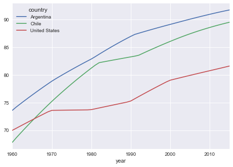
We can also easily plot all countries:
In [22]:
datyr['urb'].plot(kind='line');